Showing posts with label branding. Show all posts

Tuesday, January 15, 2013

Comcast Defiles NBC Peacock


In what was a rather long and drawn out acquisition, Comcast took over primary ownership in NBCUniversal officially in 2011. The company now boasts 2 separate ventures. The first being the widely hated Xfinity, formerly Comcast Cable, that encompasses high-speed Internet, video, and voice services. The second and more recent venture being its operations of NBCUniversal. Including stations such as USA, Bravo, and E!, NBCUniversal is one of the world’s largest entertainment companies.

In a rather confusing maneuver, Comcast has assumed the NBC peacock as their own in their latest logo redesign. This leads anybody who sees it to think, “NBC Comcast? That’s odd.” And further more to take negative experiences with the Comcast name and associate them with the beloved NBC channel.


I haven’t quite been able to wrap my head around how this move could be strategically beneficial. You would think they would want to keep the names and brands separate thus preserving their respective images and what each stands for. The NBC peacock should stand for entertainment as it always has. Now it just feels like it was abused and stands defeated. Poor guy.


Sunday, January 8, 2012

Logo Fails

Sometimes a truly horrendous logo slips through the cracks and makes it into circulation.  Who designed or approved of these logos, I am not sure, but I have noted that coincidentally several of them have a phallic appearance or sexual innuendos. 

Locum, a Swedish property management company.  No, it is not always a good idea to replace letters with hearts.  In fact it is almost never a good idea.

Logo designed in 1973 for the Catholic Church's Archdiocesan Youth Commission.  It won an award from the Art Directors Club of Los Angeles. Bravo.
Forget about bad cell reception.  Mont-Sat's got you covered. 


While not inappropriate, the sheer awfulness of these get me every time: 
The Detroit Tigers logo 1901-1902 aka an amorphous blob that slightly resembles a 4 legged creature.


1927-1928 this gem was used.  There are too many words.

They finally got it right 1934-1960 when this guy was let loose.  Right?

Don't worry Tigers - you were not the only team to have terrible accompanying logos.
What is this you ask?  Why it is a Red Sox player.  You see it now, the red sock for a head - GENIUS POINT!

Or what I like to call the digitally remastered Cubs logo from 1916. 


Poor font choice (Megaflicks)


Unfortunate spacing issues (Kids Exchange)

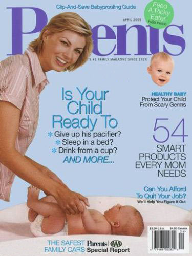
Layout fail (Parents magazine)

Just plain bad taste

I'm not sure what the appeal of these stick figures are, but they seem to be a surefire way to produce an unfortunate logo:
Right in the chest, that must sting.


Nothing quite gives you that feeling of security like someone cupping your breasts. 

Not your average dentist.

The less said about this the better

(Insert penis joke)

Apparently not so speedy anymore?
Annnnnd just to finish things off why not throw in a few unfortunate ad placements.