Locum, a Swedish property management company. No, it is not always a good idea to replace letters with hearts. In fact it is almost never a good idea.
While not inappropriate, the sheer awfulness of these get me every time:
The Detroit Tigers logo 1901-1902 aka an amorphous blob that slightly resembles a 4 legged creature.

1927-1928 this gem was used. There are too many words.

They finally got it right 1934-1960 when this guy was let loose. Right?

Don't worry Tigers - you were not the only team to have terrible accompanying logos.
What is this you ask? Why it is a Red Sox player. You see it now, the red sock for a head - GENIUS POINT!


Unfortunate spacing issues (Kids Exchange)
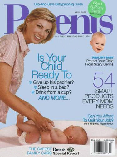
Layout fail (Parents magazine)
Just plain bad taste
Right in the chest, that must sting.


Nothing quite gives you that feeling of security like someone cupping your breasts.


The less said about this the better
(Insert penis joke)
Apparently not so speedy anymore?

Annnnnd just to finish things off why not throw in a few unfortunate ad placements.


